When to Use Dark Mode
Dark mode is a display setting for user interfaces, using light-colored text and visual elements against a dark background. Its purpose is to provide a comfortable viewing experience by reducing light emitted by screens while maintaining the minimum color contrast ratios required for readability. To keep dark mode accessible, a minimalist user interface without overly bright or saturated colors with sufficient contrast is preferred. It is especially helpful on small, handheld devices.
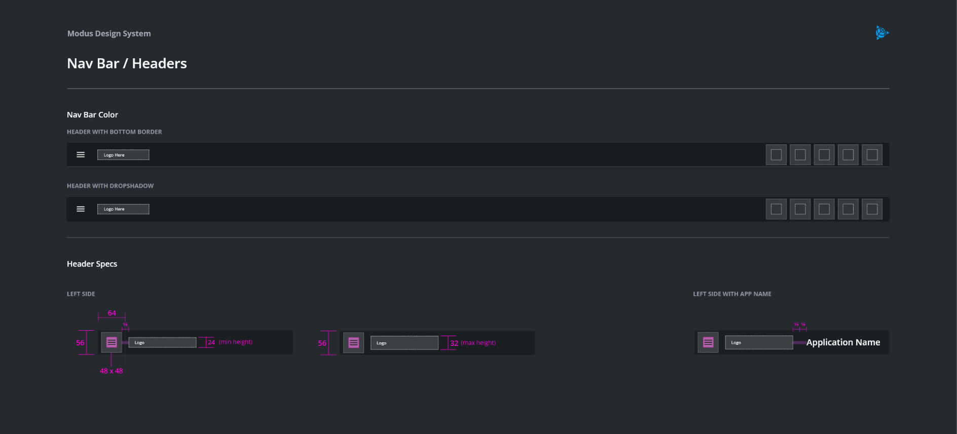
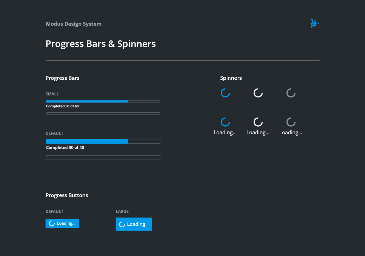
Trimble Modus dark mode applies to all available Modus components. If you decide to implement dark mode for your product, it needs to cover your entire user interface to ensure a consistent user experience: all elements of the user interface should change based on the user’s dark mode setting (e.g., components, icons, text).
Implementation of Dark Mode
The option to switch between light and dark modes in an application ideally should be available on the settings or preferences screen. If an application does not have a settings or preferences screen, it is up to the designer to integrate the feature as they see fit.
Cornerstones
The overall idea behind Trimble components in dark mode can be categorized on high level as follows:
- The general UI background is Trimble Gray
#252a2e
- Other components are shaded within the Trimble Gray palette. Please refer to the Modus components resources in dark mode. An example:

- The primary highlight for dark mode is Highlight Blue
#019aebis the main highlight color and replaces Blue Light in light mode. It affects the vast majority of controls where the user’s attention is crucial, such as buttons, dropdown buttons, checkboxes, radio buttons, switches, breadcrumbs and tab active text. Avoid using this in light mode. Here are a few examples used in Light mode:

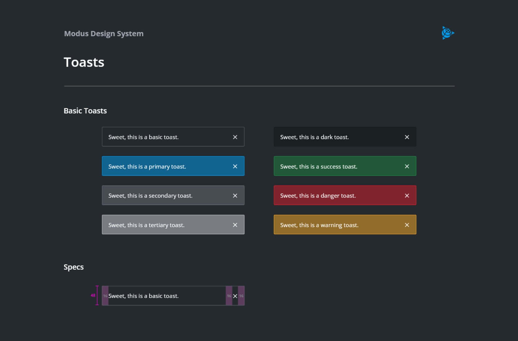
- Components using red/yellow/green text in light mode follow a different design principle in dark mode. In dark mode, white text overlays a solid or semi-transparent red/yellow/green background instead to address readability constraints. Those are mainly alerts, toasts, and input messages. An example:

Accessibility
According to recent studies, even if dark mode serves well some audiences in certain (light) conditions, it may create accessibility issues for others (e.g., a halation effect for users with astigmatism, a deviation in the curvature of the eye). Almost half of the population suffers from this condition. Halation means a blurred effect around text which intensifies with reading white text on black background rather than the other way round. With a dark background, the human’s eye iris opens to absorb more light and the lens deformation creates a fuzzier focus than while reading black text on white background. Thus, users with astigmatism see dark mode interfaces with a slight blur which limits its accessibility.
There are advantages and disadvantage to both light and dark mode. According to Nielsen Norman Group’s literature reviews, light mode tends to be better for users with normal vision (or corrected-to-normal vision), whereas users with vision conditions such as cataract and related disorders may perform better with dark mode.
The general recommendation to ensure accessibility is that designers allow users to switch between light and dark mode. Trimble Modus components offer exactly this solution.
Advantages and Disadvantages of Dark Mode
What are the potential advantages of dark mode? When to choose at least an optional offering of dark mode for your product? Experts, among others Nielsen Norman Group, are still arguing, but the most commonly known assets are:
- Better readability and less ‘blue light’ emission in low-light settings.
- Reducing eye strain and dry eyes in low-light conditions.
- To cover accessibility for users with light sensitivity or visual impairment such as low vision, high light sensitivity.
- To avoid long-term effects associated with light mode such as myopia (nearsightedness or inability to see far away objects).
- Saving battery life speculated for newer mobile devices.
- Finally, to simply address users’ preferences and current trends to dark mode. Dark mode is visually perceived as modern and slick.
Some disadvantages of dark mode include:
- Difficulties to read in strong sun reflection.
- Eye fatigue due to text blurriness, especially when harsh differences are used like pure white on pure black.
- Long pieces of bright content or text on dark background are difficult to read.
- Reading difficulties for users with astigmatism (lens curvature deviation from spherical shape).
- Need for rethinking the design of some components, for example, the use of warning or status colors on dark background due to limited readability, especially of text in red, yellow, and green.
| Date | Version | Notes | Contributors |
|---|---|---|---|
| 06/28/2022 | 1.3.0 | New guidelines added. | S. Kaukomen, A. C. Sivaraman, E. Gunther, J. de Wit, K. Phillips, M. Johns, P. Borgstein, T. Williams, U. Meza |