Overview
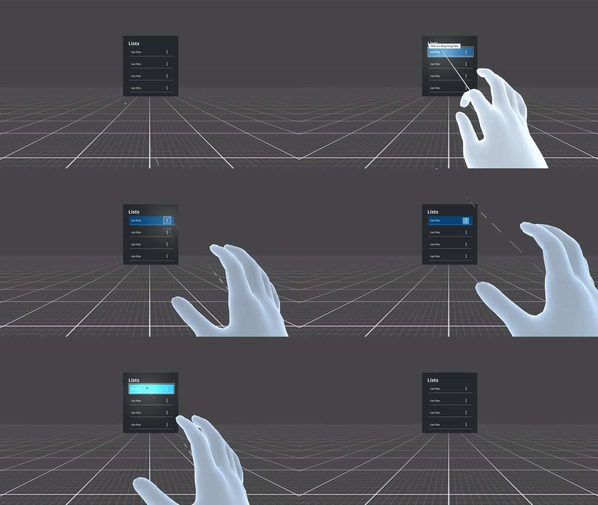
List items can contain actions represented by icons.
Lists act like buttons, that means by default they react to the push action of the index finger of users.
They can encompass two outcomes, which can exclusively be combined through a pre-command, usually a button, that would toggle the two default interactions, namely:
- Open: access relevant information
- Select: mark list item(s) for further action (e.g., delete)
Usage
Use when
- Creating vertical navigation.
- Displaying options within a menu.
- List items are especially suitable for text and data, through a layout that is easy to scan and read.
Don’t use when
- Variable, graphic-heavy items should be better displayed through cards.
- Displaying multiple parameter data. Consider creating a table for this purpose.
Types
Lists are qualified by content type.
| Example | Content Type | When to use |
|---|---|---|
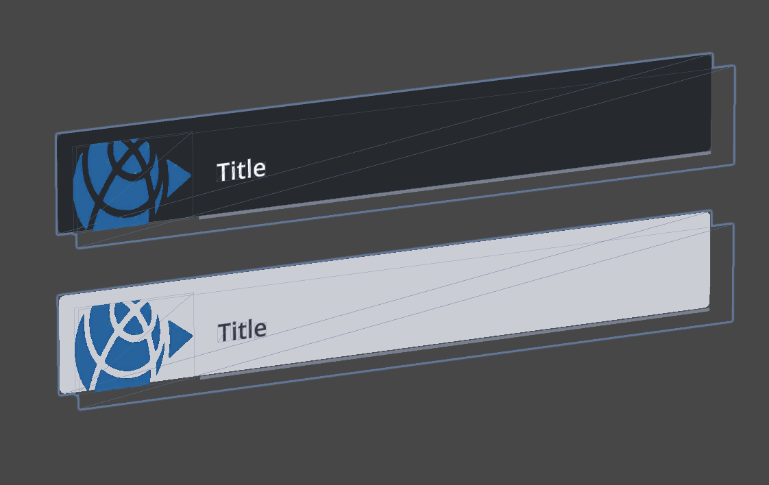
| Thumbnail, No Action | Use it to provide previews of content better understandable through images (i.e., JPG, 3D-models, etc.), that allow users to determine actions required on a glimpse. |
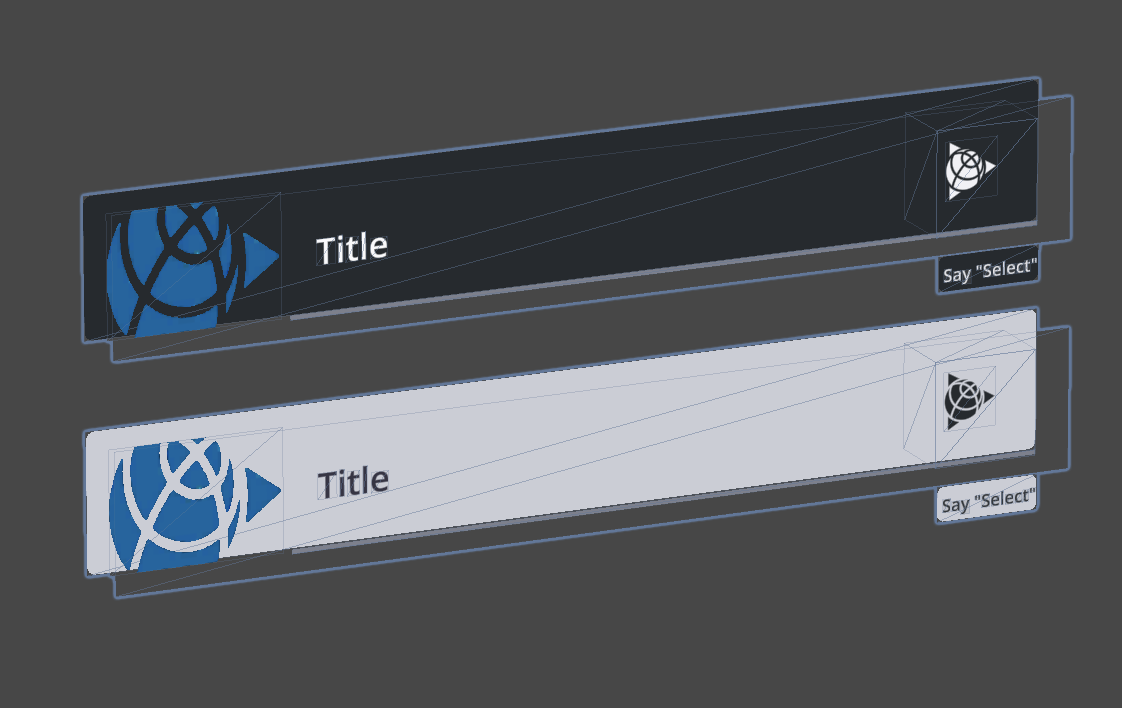
| Image, Action Right | Use it to provide previews of content better understandable through images (i.e., JPG, 3D-model), that allow users to execute quick expandable actions required on a glimpse. |
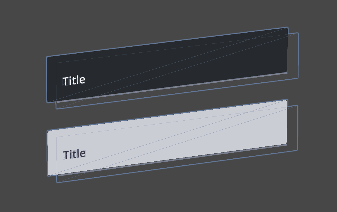
| Text, No Action | Use it to provide insights to related items. |
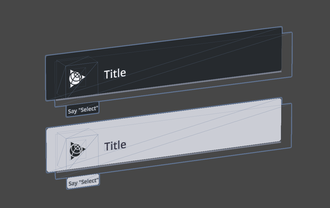
| Text, Action Left | Use it to provide insights to related items, that allow users to execute quick actions, usually selection. |
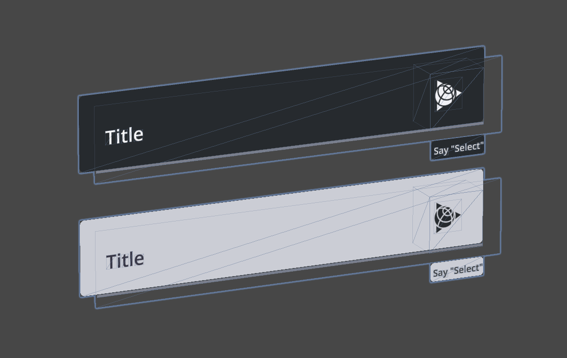
| Text, Action Right | Use it to provide insights to related items, that allow users to execute quick expandable actions. |
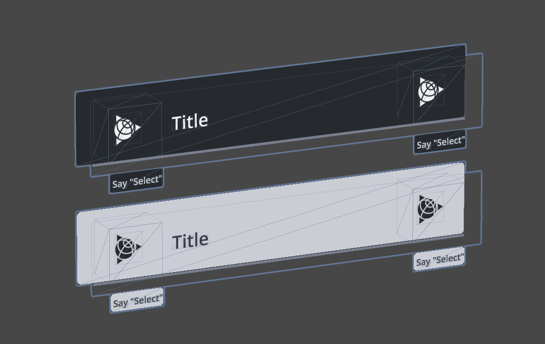
| Text, Action Double | Use it to provide insights to related items, that allow users to execute quick expandable and selection actions. |