Overview
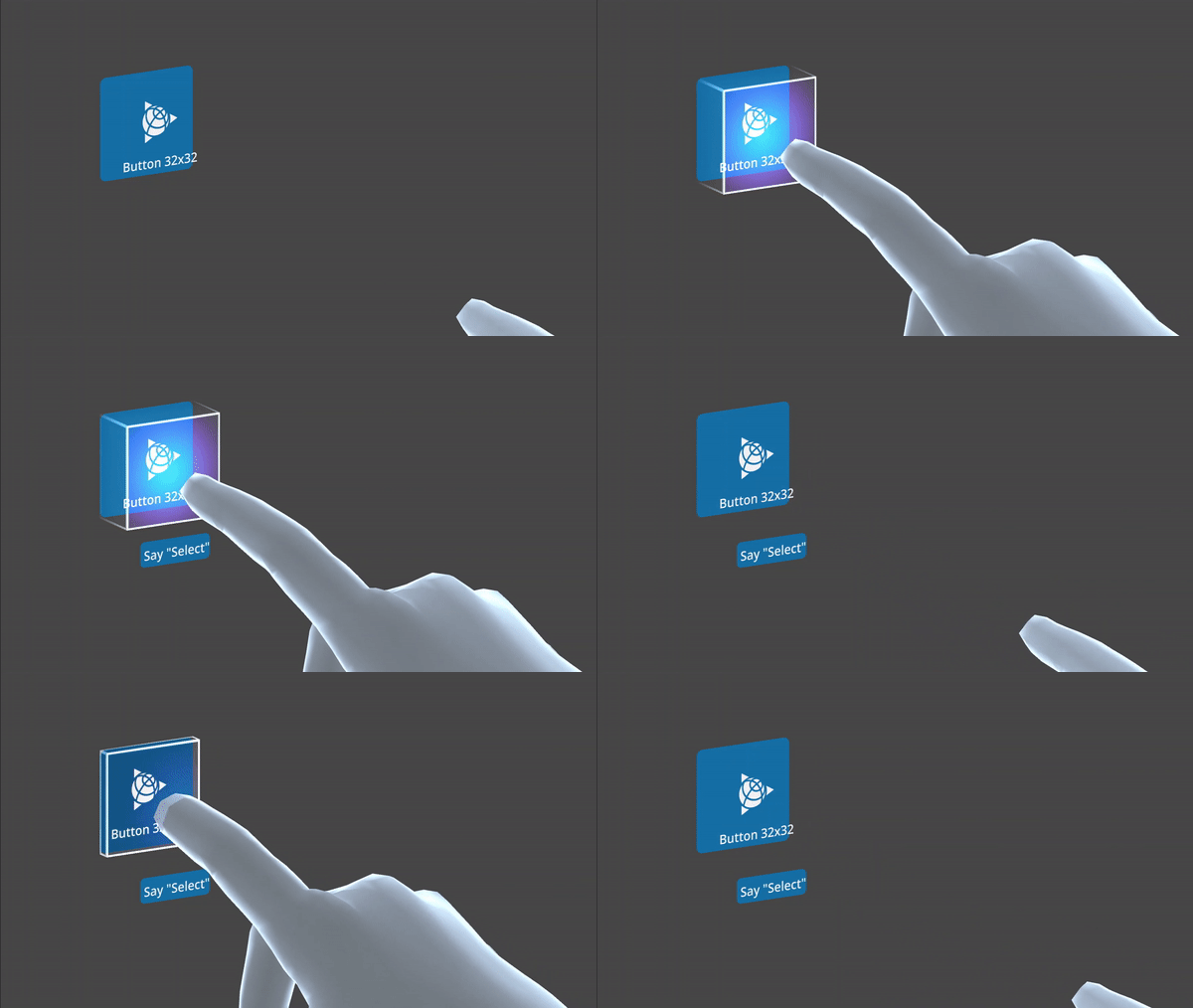
Buttons express what action will occur when the user clicks or touches it. Buttons are used to initialize an action, either in the background or foreground of an experience.
Buttons have visual cues and affordances that help increase interaction confidence with users.
Since their “activator” (collider) is attached to the users’ index fingers, by default they react to the push action of the index finger of users. Buttons can be modified in their size, if the experience so requires. Pretty much like in real life, the larger the button, the greater the effort to pulse it, therefore as the button size increases, so does the position of the “activator” from the finger to the entire hand.
Far interaction works by default and the button can be triggered using Air Tap.
Usage
Use when
- Affording interaction to key behaviors and features.
- Confirming or submitting information entered into a form.
- Cancelling and action, except when an unambiguous gesture is available.
- Resetting a form or dataset.
- Closing a container or section.
- Opening a menu.
- Moving forward or backward through a wizard-type workflow.
- Creating an object within a group.
- Applying a non-critical action to a dataset.
Don’t use when
- Triggering navigation interactions, i.e. pan, orbit, zoom.
- Initiating navigation, i.e. teleport.
- Presenting the user with one or more high or medium-high actions specific to a task.
Types
Color Progression
| Example | Emphasis | When to use |
|---|---|---|
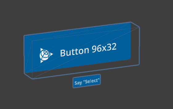
| High | Use to draw attention to the primary action on a scene. There should be only one Primary Button on a UI at a time. Not all interfaces presented to users require a Primary Button. |
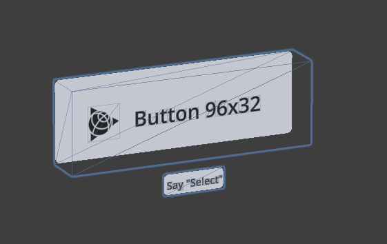
| Medium - Light | Used for secondary actions, establishing additional visual hierarchy on the scene. |
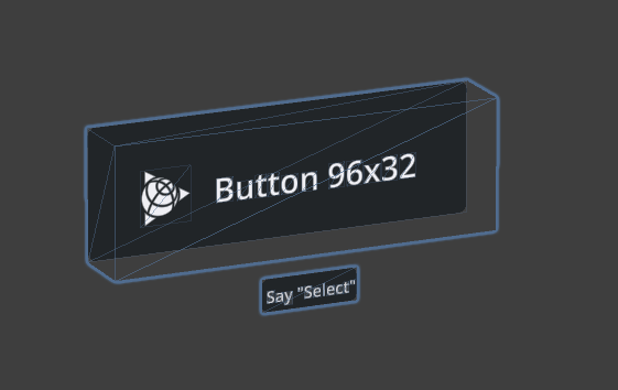
| Medium - Dark | Used for secondary actions, establishing additional visual hierarchy on the scene. |
Form Progression
| Form | Example | When to use |
|---|---|---|
| Round | 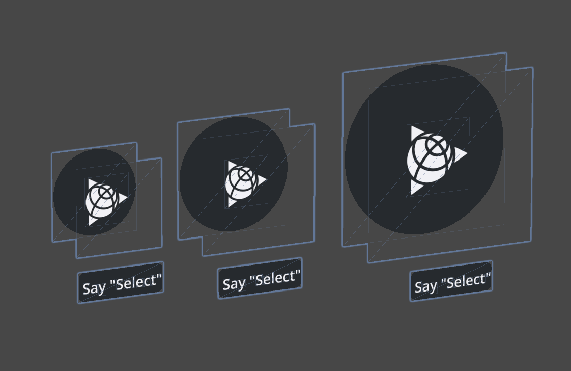
| Use in-line or in “Button Groups”, when an interface requires many commands that are similar in size and hierarchy, and when there is limited UI space available. Recommended for radial menus. |
| Square | 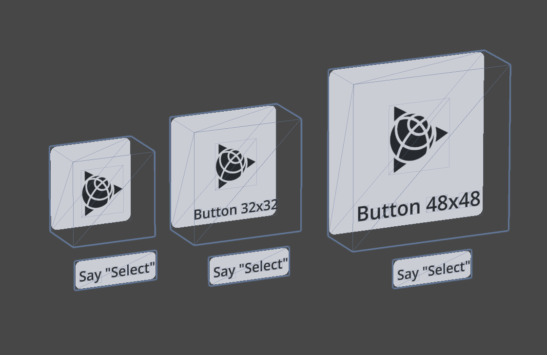
| Use in-line or in “Button Groups”, when an interface requires many commands that are similar in size and hierarchy, and when there is limited UI space available. |
| Rectangular | 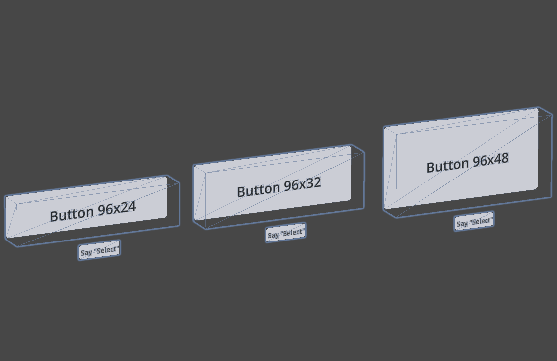
|
Primary use is for single actions that users can take. They can be used for options, but should be used judiciously not to disrupt visual hierarchy or functionality. Use in:
- Dialogs - Modals |
Functional Progression
| Action | Example | When to use |
|---|---|---|
| Trigger | 
| Trigger action on hit. |
| Select | 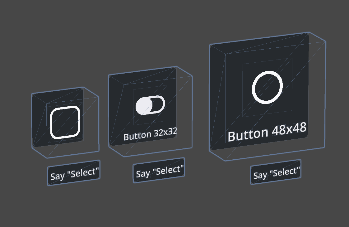
|
Execute a selection.
- Radio = single selection - Check = multiple selection - Switch = turn on/off |
| Toggle | 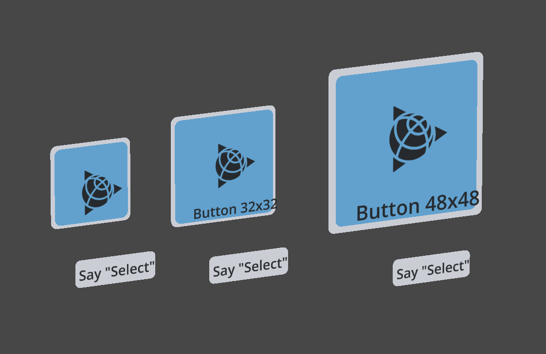
| Trigger an action and/or update the display of information. |