Specifications
Placement
- The side navigation menu is the top most element.
- The footer displays under the side navigation menu.
Shadows
- Use Level 2 shadow on the right side of the side nav
Icons
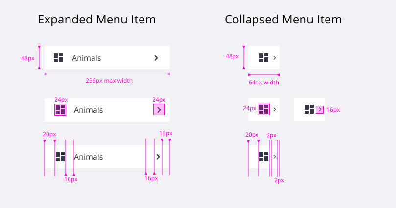
- Leading icons are required for all items in the side navigation.
- All menu items must have a unique icon. When the menu is collapsed, only icon and an optional chevron are visible. The user needs to be able to distinguish between each item by icon alone.
Sizing
- Dynamic menu width depends on the longest menu item (padding to be retained).
- Max width of the menu is 256px.
- If the menu text is too long, truncate it and show full menu item name on hover.
- The side nav does not support allowing the user to resize its width.
Colors
There are two color options available. They can be used in the following combinations:
- White Navbar with white Side Navigation.
- Blue Navbar with white Side Navigation.
- White Navbar with blue Side Navigation.
| White Nav Colors | Blue Nav Colors | |
|---|---|---|
| Background |
White
Gray 10
#ffffff
#171c1e
| Blue Dark
#0e416c
|
| Selected Item Background |
Trimble Blue
Highlight Blue
#0063a3
#171c1e
| Blue Light
#217cbb
|
| Text Link |
Trimble Gray
White
#252a2e
#fff
| White
#ffffff
|
| Hover Link |
Gray 0
Gray 8
#e0e1e9
#464b52
| Trimble Blue
#0063a3
|
| Icon |
Trimble Gray
White
#252a2e
#fff
#7d808d
| White
#ffffff
|
| Chevron |
Trimble Gray
White
#252a2e
#fff
| White
#ffffff
|
Padding and Spacing
| Class | Property | Size (px/rem) |
|---|---|---|
| Menu Item | height | 48/3 |
| Menu Item | padding-left | 20/1.25 |
| Menu Item Icon | width, height | 24/1.5 |
| Collapsed Menu Item | width | 64/4 |
| Collapsed Menu Item Chevron | width, height | 16/1 |
| Extended Menu Item | width | 256/16 |
| Extended Menu Item Icon | padding-right | 16/1 |
| Extended Menu Item Chevron | padding-right | 4/0.25 |

Typography
| Class | Type | Size (px/rem) | Font Weight |
|---|---|---|---|
| Menu Item | Body 1 | 14/0.875 | Regular/400 |
| Back Menu Item | Body 2 | 12/0.75 | Regular/400 |
| Level Header | Heading 4 | 14/0.875 | Semi-bold/600 |
Behaviors
- On load, show a collapsed menu (recommended).
- The side nav supports up to 3 levels of navigation.
- Clicking a menu item with sub items opens the side nav to its full width.
- Clicking the hamburger menu opens the side nav to its full width.
- When the user has clicked on a side nav link, the side nav collapses and the user is navigated to the specified content. If the user clicks outside of the side nav, the side nav collapses.
- Hovering over a menu item icon displays a tooltip with the menu item name. When the menu is collapsed, hovering over the icon displays a tooltip. In the expanded view, if the menu item’s name is too long (truncated to fit the width of the side nav), display a tooltip with the menu item’s full name. Follow the Tooltip guidelines for further reference.
- If the user clicks on a folder, that level of navigation slides out and is replaced with the next level of navigation under that folder.
- The folder’s name appears on top of the side nav to let the user know their location or level.
- To return to the previous level, the user may use the back button on top of the side nav.
Animation
- Ease in: 250mm; Ease out: 200mm
- The side nav slides in from the left to the right, when the menu is expanded or opened.
- The side nav slides in from the left to the right, when the user navigates to the next menu level.
- The side nav slides in right to left, when the user clicks a back button.
Responsiveness
| Breakpoint | Value (px/rem) | Expanded | Collapsed |
|---|---|---|---|
| X-Small | 320/20 | Overlay | Hide Menu |
| Small | 576/36 | Overlay | Hide Menu |
| Medium | 768/48 | Overlay | Hide Menu |
| Large | 992/62 | Overlay or Push | Hide or Collapse |
| X-Large | 1200/75 | Overlay or Push | Hide or Collapse |
| XX-Large | 1600/100 | Overlay or Push | Hide or Collapse |
What's changed
| Date | Version | Notes | Contributors |
|---|---|---|---|
| 03/14/2022 | 1.3.0 | New pattern added. | J. Wittmeyer, C. D. Savio Lazaro, S. Taylor, J. de Wit, E. Gunther, T. Manham, N. Cadsawan, P. Karukkuvel, E. Deleon, A. Tucker, L. Meskanen-Kundu |


